
This recent book design project aimed to try and produce a title which was a little more than the usual trade paperback rock biography. Instead of pages of raw text with a selection of photos rammed into the middle, this book was to be full of photographs, graphics and text throughout. This made life difficult as it was important to have the images relate as much as possible to each chapter. Because of this, full page images could be set up quite early on and shuffled around as needed but a lot of the detailed layout had to be done right at the end. The book covers a set period in the band’s history, around their classic Deep Purple In Rock album. As that sleeve has a striking sky blue background, I decided to take this colour as the unifying theme for the book, applying it to chapter headings, photo captions, page rules, borders etc. I also used it as a background colour on the front cover. There was a thought to use the sleeve itself for the front, but I felt this looked more like a discography than a history, and might put off less dedicated fans of the band. Instead a serious looking publicity shot of the group was selected, two of them sat on wooden Schweppes boxes in the photographers studio! The problem with the photo is that it clipped off the left and right sides, so I had to recreate any missing areas once it had been placed exactly where I felt it worked best (the version above is actually missing a bit of shoe which was later sorted out). To give it a little more impact, the photo was then posterized to a number of levels, with the background cut away to allow the blue colour to surround the image. As a lot of the book is to do with the band’s touring, a montage of concert adverts was created then feathered from top to bottom. I did the entire front in Photoshop which I prefer to work with on a multi-layered job like this, including the type. The cover needed a heavy typeface to reflect the band’s music, and I worked with the Futura family for this with just the slightest hint of a bevel edge to help it stand out over the darker parts of the photo.
Inside the pages had a number of style ideas which remain common to most pages, and which can be seen on this sample spread.
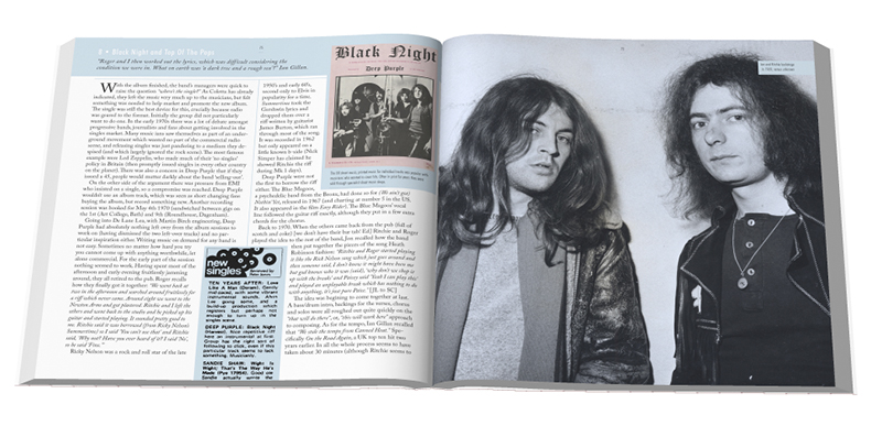
You can see more spreads from the book and read about the content on the Easy On The Eye Books site.
With the publisher’s permission, I can show two of the early design ideas below. The first uses the original album sleeve but was abandoned for the reasons mentioned above. The second I liked – a particularly manic photo from a lost TV performance – but one of the author’s pointed out that the photo didn’t show all the musicians, so it too was shelved. In the end it worked well as the back cover of the book with some changes.


