
This Kodak gift set hit so many Easy On The Eye buttons that I almost felt guilty handing over the ten pounds which the dealer wanted for it last month, even more so having seen one up for $175 online since. Fascinating though industrial design is, Kodak camera history is for others (mind you, the camera itself was designed by Kenneth Grange, one of the UK’s foremost industrial designers – think original high speed intercity 125. I really like the way the separate camera ‘case’ hinges on to the camera body). I mostly enjoy their post-war packaging designs which managed to always look sharp, keeping the Kodak colours and identity while adapting to the changes in fashion and retail.
This particular UK designed and manufactured (see we can do it!) camera was launched in 1959 and phased out by 1965, so this gift set probably came towards the end of that timeline (the camera was sold separately throughout).
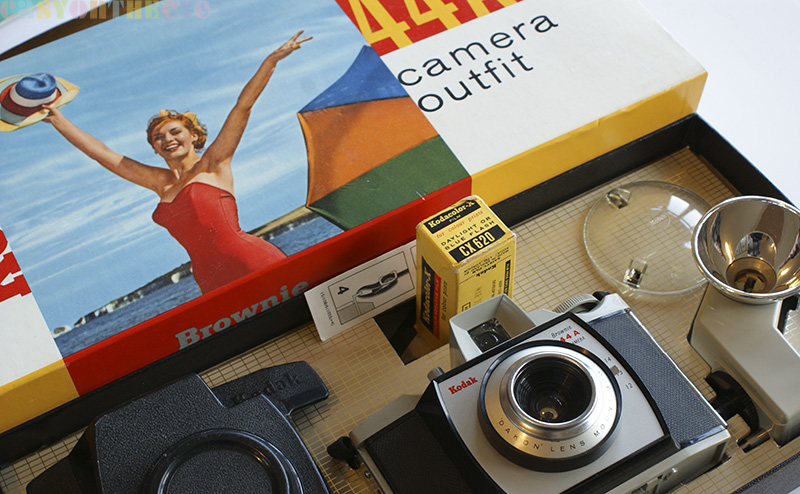
What really swung it for me was the almost pristine condition. The camera has clearly had a fair bit of gentle use, but the owner must have carefully put it back in the original box each time. The accessories are seemingly unused and even the little Ever Ready battery is still in situ. The only thing missing were two rolls of film which originally came in the box, so I’ve put one from my collection back in to be going on with.
The box itself is so well constructed, with a gold foil grid pattern on the top of the tray inside, and neat little hidden card reinforcements to keep everything in position. There is a user guide and even a little slip of paper showing you how to assemble the camera strap properly.

The box design is fab, and you can imagine this sitting on a department store glass shelf or the window of a local chemist. The typography is a gentle mix; the serif face for Kodak and the word Brownie go back some time (this version of the Kodak logo first appeared in the 1930s and was only (foolishly) replaced in the 80s) and appeared in the same font (which I imagine was specially done for the company) on earlier Brownie camera boxes. The yellow which was previously used as an overall colour on all Kodak product packaging is here reduced to the sides only. Instead the designer (who remains unknown) has opted to go for a more dramatic and modern white background on the box top with the Kodak red and yellow reused for the model number.
 This all makes the colour image of the famous Kodak girl stand out even more. She was a fixture of the company’s packaging right back into the nineteenth century (and the subject of a book in recent years). Originally drawn, photos were used from the early thirties onwards and colour crept in during the fifties. Given the chalk cliffs in the background I imagine this is an English sourced photograph and model. The same images were then often used on the photo wallets prints came back from the labs in and enlarged as lifesize cardboard displays (the one shown below is similar and dates from 1964) to stand outside photographic shops or chemists providing D&P services to holiday makers.
Talking of which, it looks to me like there is a part used film still in the camera. Looks like a challenge!
Some nice examples of Kodak (and other) Super 8mm boxes here
http://mediumcontrol.com/blog/inspiration-packaging-super-8-love/

[…] in sturdy but utilitarian boxes which have to be pulled apart to get at the kit inside. So this Kodak ‘camera outfit’ is very much of its time (circa 1965). You could buy the camera (designed by a famous industrial […]
A tenner? Not too shabby!
[…] is a post showing a nice 1960s Kodak wallet on the site, and a fabulous Kodak camera box from the same […]